MyOlavSon Flex Builder
MyOlavSon Flex Builder
I designed the Flex Builder for MyOlavSon, a feature allowing customers to easily bundle products. The interface focused on simplicity and ease of use, with a clean layout and interactive elements. I also created an animated prototype to showcase the user experience. While the product isn’t live yet, the design and prototype are ready for a smooth launch.


Research
Research
To create the Flex Builder for MyOlavSon, I analyzed their website, product range, and brand tone to ensure alignment with their premium design. Discussions with the client revealed that most buyers are middle-aged, so I prioritized simplicity and ease of use in the design.
To create the Flex Builder for MyOlavSon, I analyzed their website, product range, and brand tone to ensure alignment with their premium design. Discussions with the client revealed that most buyers are middle-aged, so I prioritized simplicity and ease of use in the design.
Research
To create the Flex Builder for MyOlavSon, I analyzed their website, product range, and brand tone to ensure alignment with their premium design. Discussions with the client revealed that most buyers are middle-aged, so I prioritized simplicity and ease of use in the design.
Wireframes
Wireframes
I designed a split-screen layout to create a seamless bundle-building experience. On the right panel, users could browse product categories and view items with a quick-look feature, allowing them to add products to the bundle without navigating away. The left panel displayed the selected products, along with their price, specifications, and a remove button. A total price section at the bottom included a checkout button and a progress bar that increased with more products added, unlocking greater discounts to boost sales. This design ensured that users could easily track their bundle while being encouraged to add more items.
I designed a split-screen layout to create a seamless bundle-building experience. On the right panel, users could browse product categories and view items with a quick-look feature, allowing them to add products to the bundle without navigating away. The left panel displayed the selected products, along with their price, specifications, and a remove button. A total price section at the bottom included a checkout button and a progress bar that increased with more products added, unlocking greater discounts to boost sales. This design ensured that users could easily track their bundle while being encouraged to add more items.
Wireframes
I designed a split-screen layout to create a seamless bundle-building experience. On the right panel, users could browse product categories and view items with a quick-look feature, allowing them to add products to the bundle without navigating away. The left panel displayed the selected products, along with their price, specifications, and a remove button. A total price section at the bottom included a checkout button and a progress bar that increased with more products added, unlocking greater discounts to boost sales. This design ensured that users could easily track their bundle while being encouraged to add more items.
Design
Design
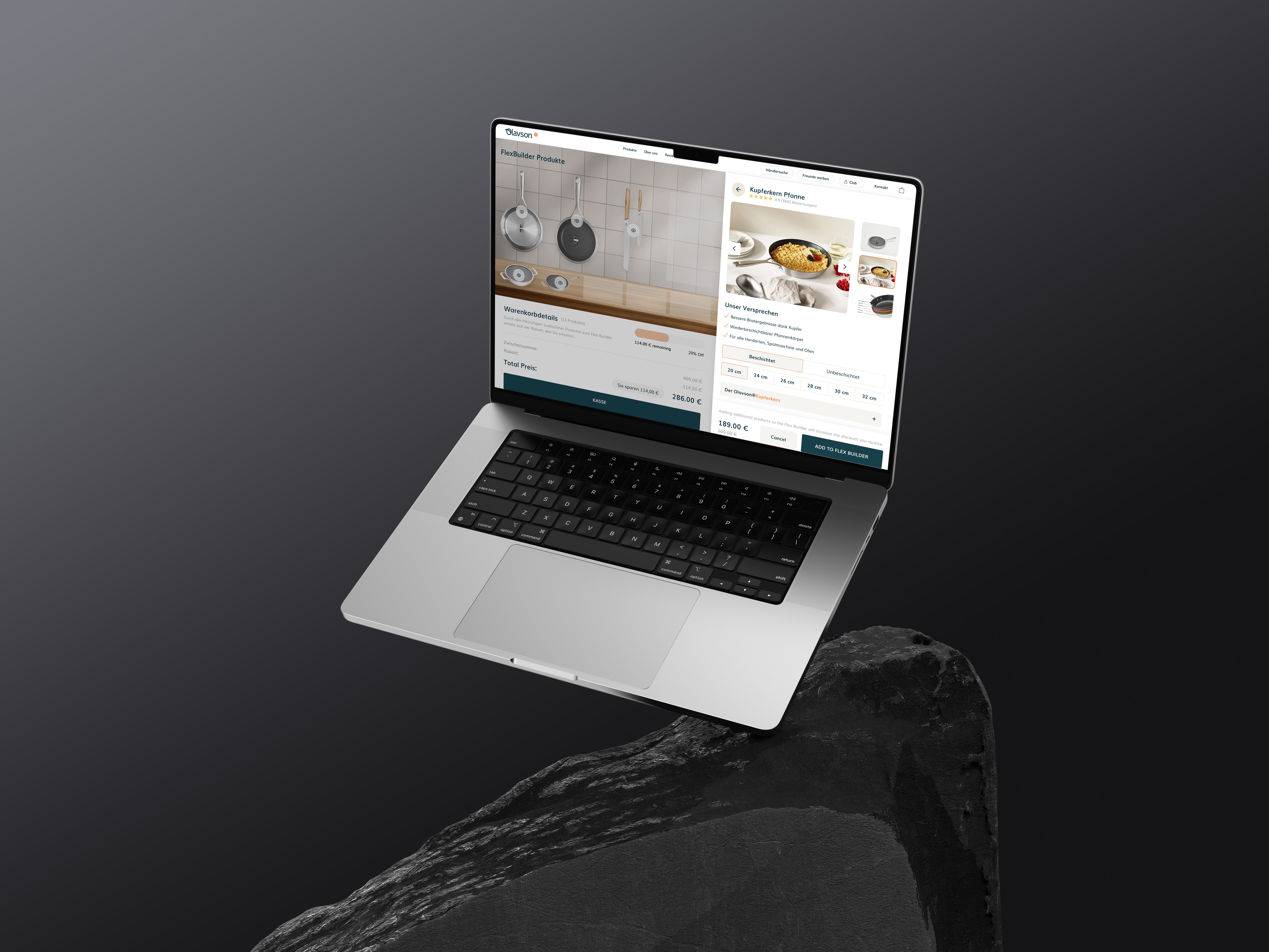
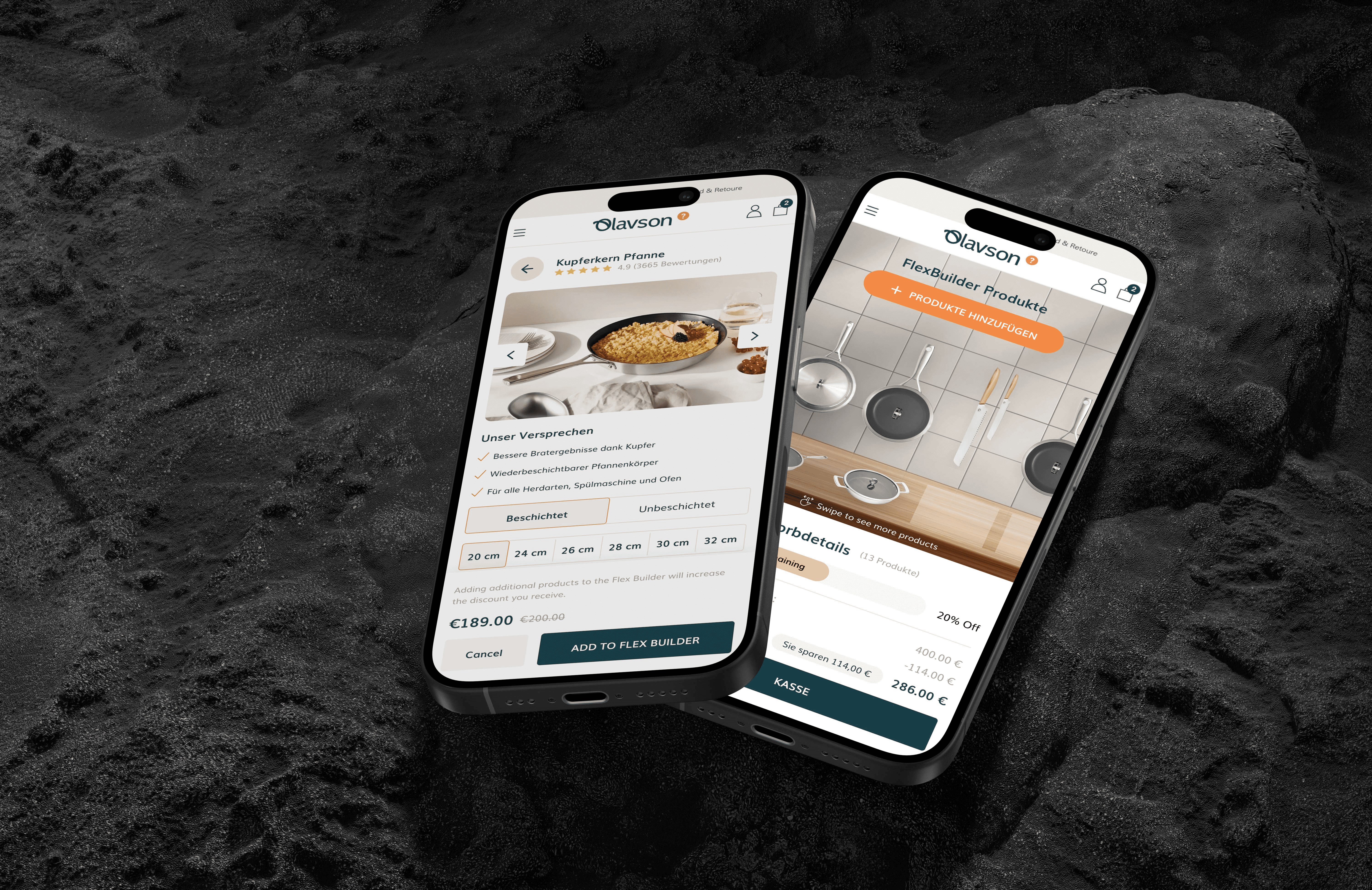
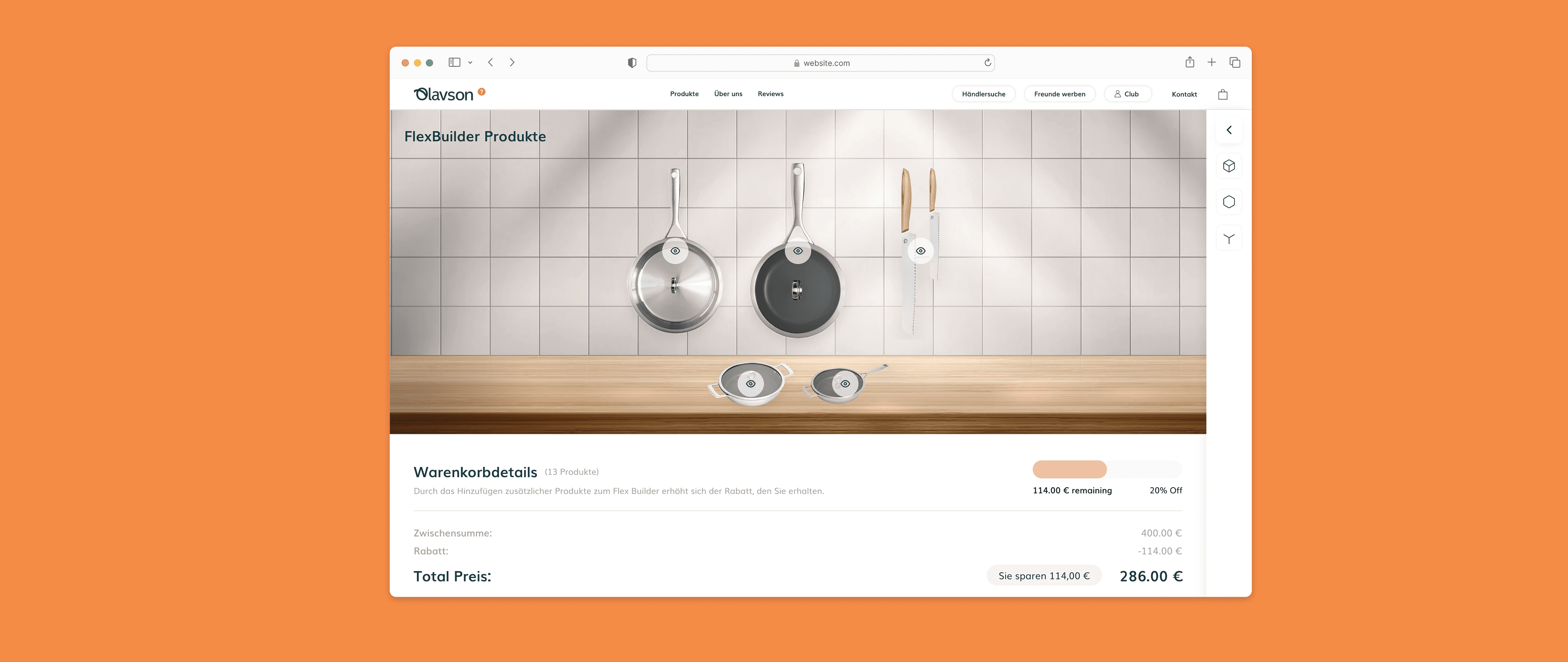
Once the wireframes were finalized, the styling process focused on aligning with MyOlavSon’s premium brand. A clean white base was paired with bright orange as an accent and a dark teal for buttons and key elements, ensuring strong contrast and visual appeal. The left panel featured a kitchen-top background where selected items dynamically appeared as PNGs, either placed on the counter or hanging on the wall, creating an interactive and engaging visual experience. The font Muli, taken from their design system, reinforced brand consistency while maintaining readability.
Once the wireframes were finalized, the styling process focused on aligning with MyOlavSon’s premium brand. A clean white base was paired with bright orange as an accent and a dark teal for buttons and key elements, ensuring strong contrast and visual appeal. The left panel featured a kitchen-top background where selected items dynamically appeared as PNGs, either placed on the counter or hanging on the wall, creating an interactive and engaging visual experience. The font Muli, taken from their design system, reinforced brand consistency while maintaining readability.
Design
Once the wireframes were finalized, the styling process focused on aligning with MyOlavSon’s premium brand. A clean white base was paired with bright orange as an accent and a dark teal for buttons and key elements, ensuring strong contrast and visual appeal. The left panel featured a kitchen-top background where selected items dynamically appeared as PNGs, either placed on the counter or hanging on the wall, creating an interactive and engaging visual experience. The font Muli, taken from their design system, reinforced brand consistency while maintaining readability.


Prototype
Prototype
To give the client a clear vision of the final product, I created an animated prototype that brought the Flex Builder to life. Subtle animations were added to demonstrate how the product would look and function, from adding items to the bundle to the smooth transitions of the progress bar and price changes. This interactive prototype allowed the client to visualize the user experience and how the dynamic features would enhance engagement, helping to ensure the final design aligned perfectly with their expectations.
To give the client a clear vision of the final product, I created an animated prototype that brought the Flex Builder to life. Subtle animations were added to demonstrate how the product would look and function, from adding items to the bundle to the smooth transitions of the progress bar and price changes. This interactive prototype allowed the client to visualize the user experience and how the dynamic features would enhance engagement, helping to ensure the final design aligned perfectly with their expectations.
Prototype
To give the client a clear vision of the final product, I created an animated prototype that brought the Flex Builder to life. Subtle animations were added to demonstrate how the product would look and function, from adding items to the bundle to the smooth transitions of the progress bar and price changes. This interactive prototype allowed the client to visualize the user experience and how the dynamic features would enhance engagement, helping to ensure the final design aligned perfectly with their expectations.




More Work More Work
More Work More Work
©2024 DAOLIN AJETI
Go Back To Top
©2024 DAOLIN AJETI
Go Back To Top

